CHAPTER 1
Bringing The New York Times Audio to market.
At the start of 2020, I joined a small team to figure out how we might productize The New York Times’ audio report. The company was looking to building off of the massive success of The Daily and wanted to see if they could create a dedicated home for its' growing audio catalogue—which contained not just Times content, but also articles from third-party publishers that we’ve acquired contracts for.
It’s a bit difficult to capture all the details of how we went from a confident “hunch” to building the first app that the Times has released in nine years. But this case study will be dedicated to giving you an overview of some of my main contributions in designing and building the app from scratch—
Over the course of three years, I operated as a lead IC on the team. I co-led our initial exploratory sprints alongside Grace LaRosa and Kevin Twohy.
I led design through our internal dogfooding tests, through a phased beta program, and finally brought the app to market in the summer of 2023, specifically—
I developed our design language, codifying it into our Figma design library that we refer to as “Tape”
I designed our Today and Following screen; and consulted on our Discover and My Audio tabs
I developed our approach to accessibility and VoiceOver documentation, which has been adopted by several teams at the Times.
I helped hire and mentor three designers.
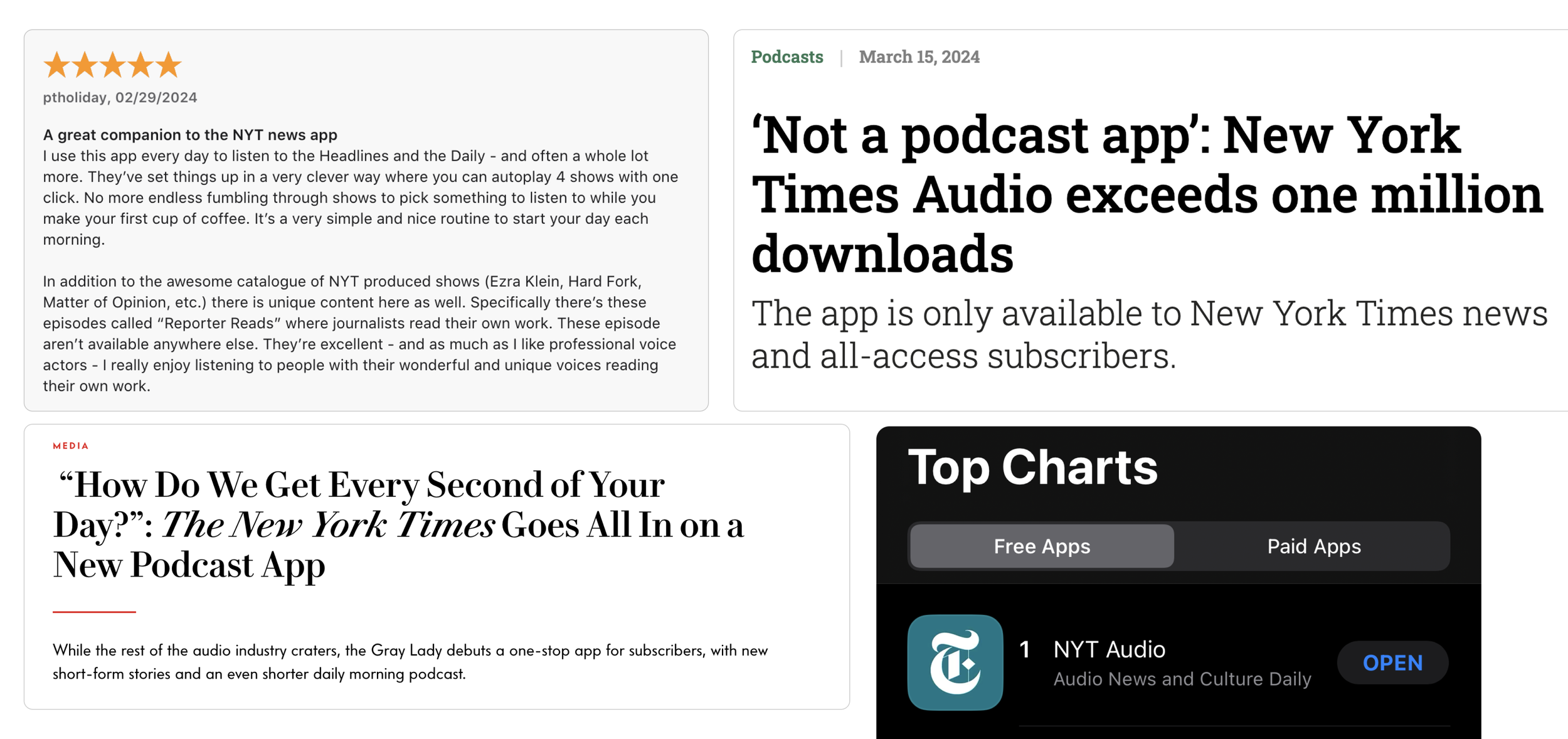
- Debut at #1 in app store, 4.7 rating
- 145k weekly active users
- 65% conversion to subscribers
- Attracting a younger and more diverse audience
- Established best practices in a11y documentation
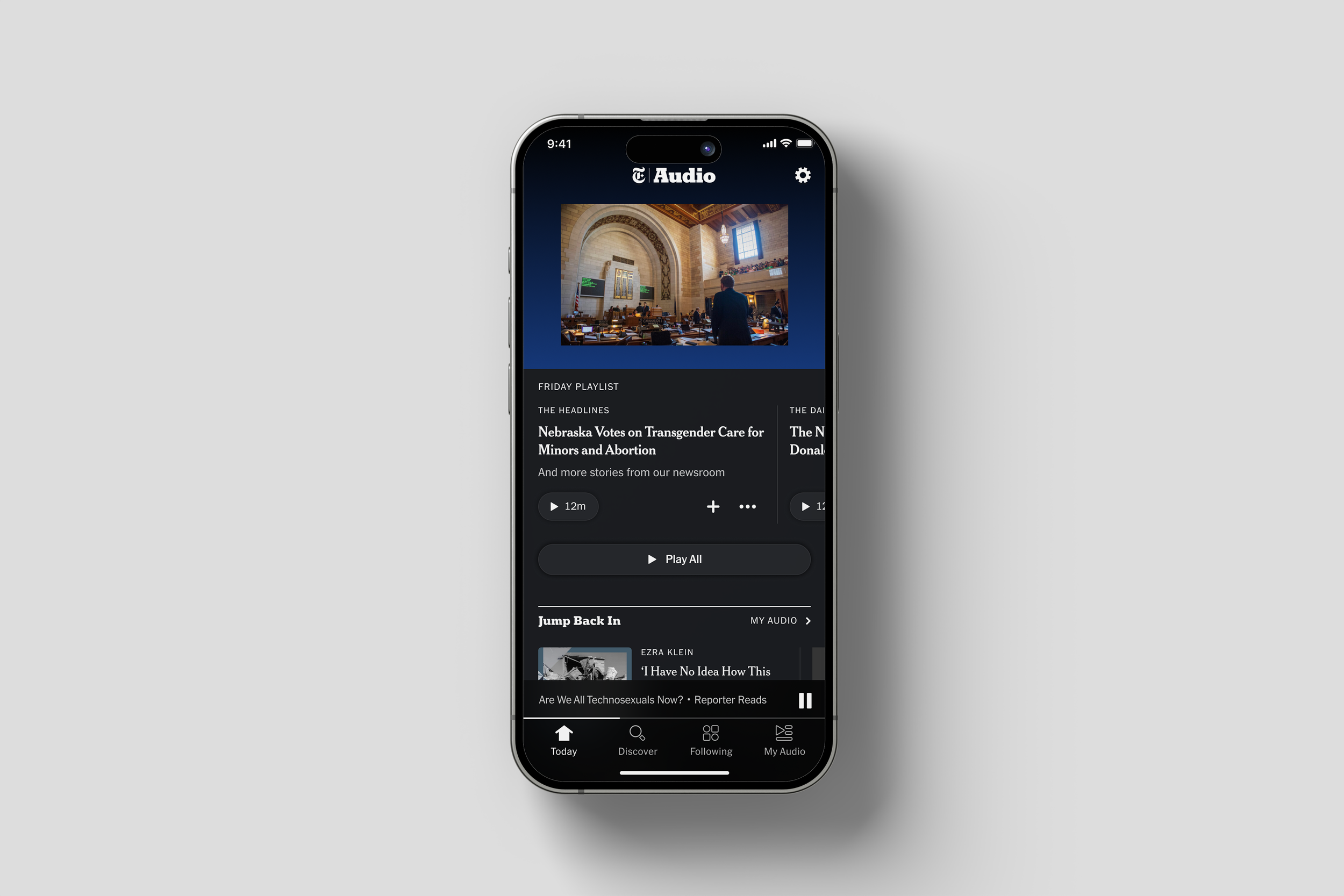
A view of our Today screen
The problem to solve
When I joined the team, there was a ton of research that had been collected on audio habits amongst Times subscribers. The one problem that we felt that we were in the best position to solve was helping people discover something great to listen to.
We wanted to capitalize on the Times’ reputation as a voice of authority. Our assumption was that we could position ourselves as a daily recommender of high quality audio journalism.
Additionally, I had some initial thoughts around how we could specifically solve for discovery in a design approach:
Mirror the hierarchy of the NYT front page to give our home experience a sense of narrative
Emphasize editorial framing to explain why a story is worth listening to
Leverage photojournalism as a signal to compel users to a story, and to distinguish us away from podcatchers
Low to high to low
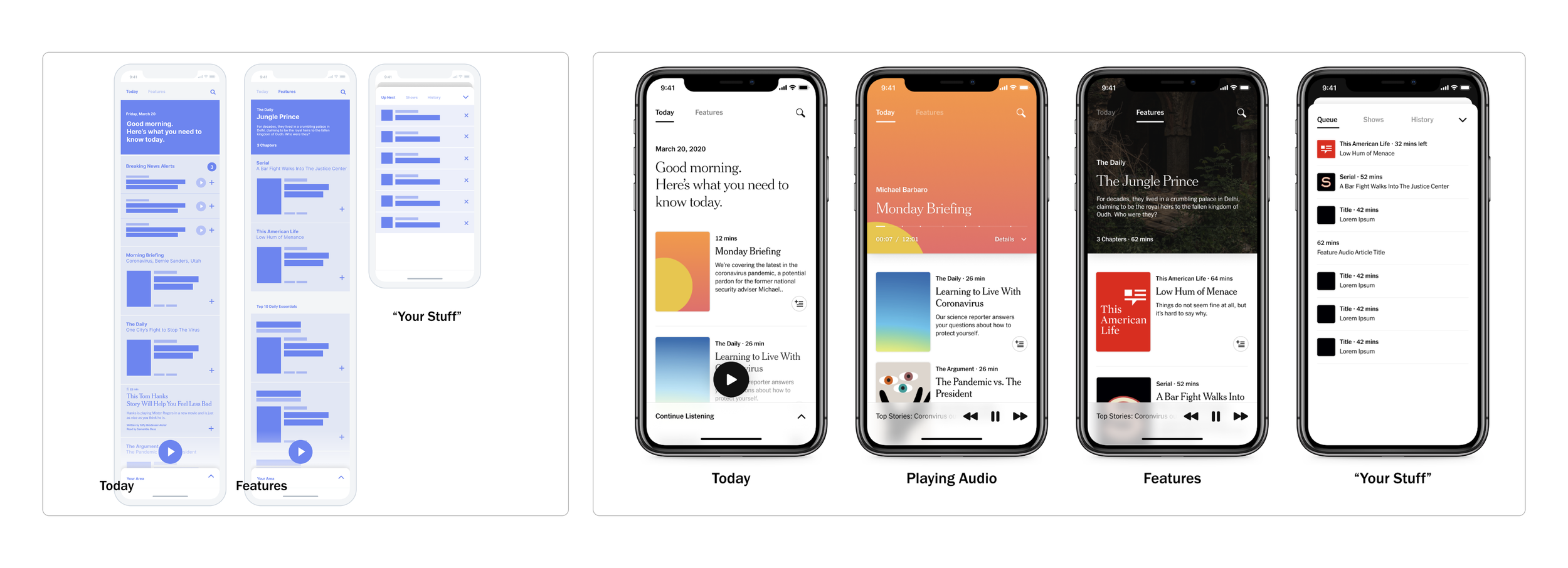
In exploring how we might begin solving the problem discovery, we also were working towards a pretty aggressive deadline to share an illustrative picture of what we might build with our executive team. And so in my work, I jumped back and forth pretty quickly from sketches to provocative design mockups.
Here’s an example of one idea I was exploring around creating two feeds—one to meet the news moment of the day, and a second to showcase evergreen features:
Early design concept explorations tackling the problem of content discovery and IA.
As part of my design practice, I also love to build prototypes. From my consulting days at Meta, I picked up Origami— and have gotten pretty comfortable at building motion prototypes fairly quickly. Here is a prototype exploring more of a visual-forward UI to lean into a sense of immersion and getting lost in our audio stories.
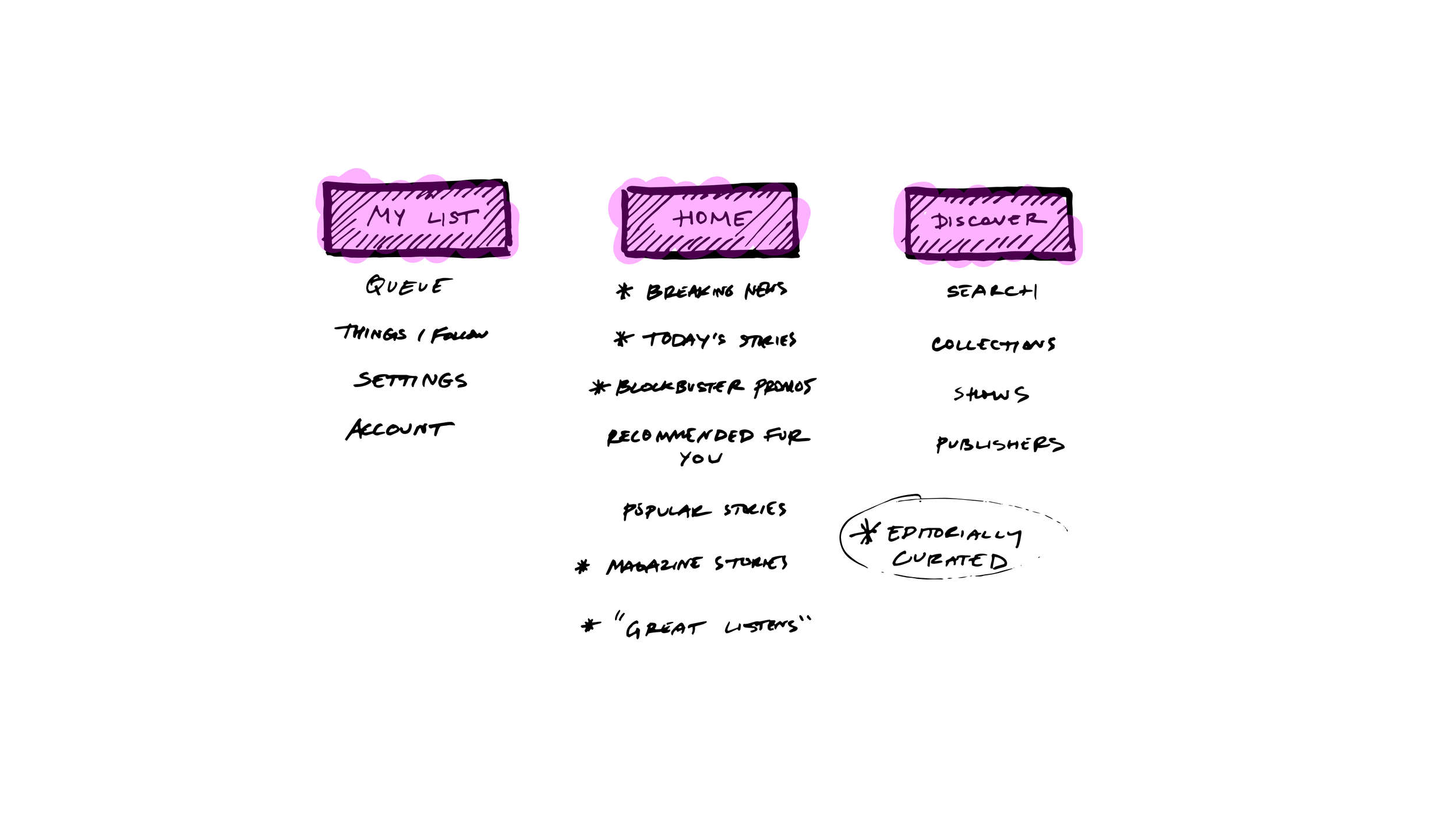
These prototypes and early explorations helped us move pretty quickly to gain alignment with our stakeholders. It set the foundation for what we could attempt to build quickly and start learning from. From our early sprints, we established a pretty simple, three tab structure as a north start that contained—an editorially curated Home, a Discover acting as a search and catalogue, and My List which would house expected user preferences.
Dogfooding
We were ready to build! Abstracting our early explorations and the app map into its simplest form, I designed a single feed that we could build quickly to test internally amongst ourselves and our stakeholders.
This initial six week release would be leveraged to allow our editorial team to begin iterating on their programming workflow and to test our core value proposition.
Alpha
We saw positive responses from our internal release. We found that we had enough content to readily program daily, and we collectively found promise in the core value proposition of a newsroom-powered audio app.
We then worked towards a larger release to a group of ~250 internal employees. I worked to refine the experience, exploring our tab structure, and iterating on our “Today” experience.
As our app ingested not only Times content, but narrated articles from external publishers, one problem I set out to solve was how we might guide users through all the types of content on offer.
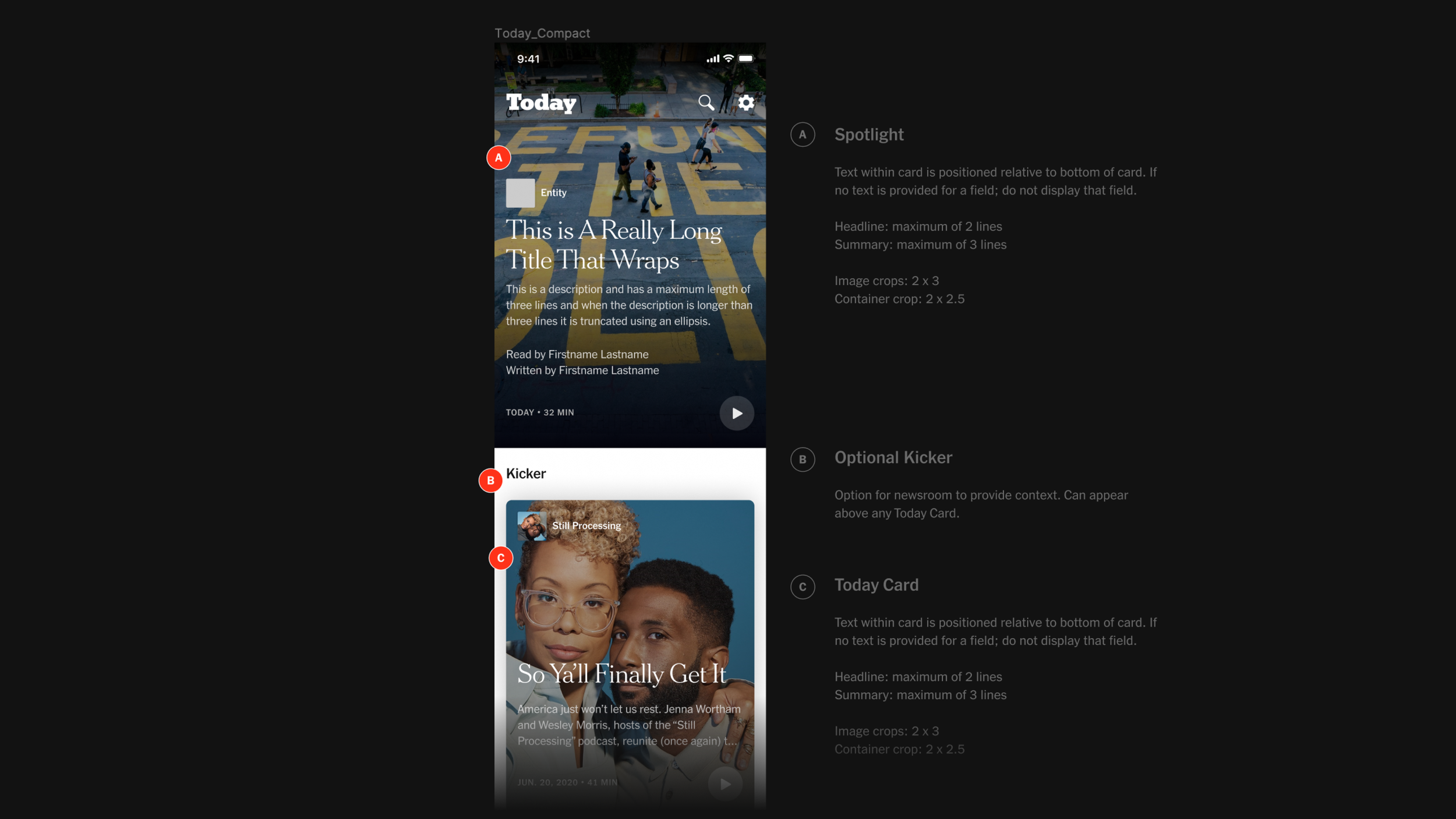
Here’s a view of our app at Alpha. In it, I was exploring:
Framing the day by leading with a big moment at the top of the feed
Editorially-labeled sections and descriptive framing
Square artwork for podcasts versus circle artwork to denote publishers
A “read-aloud” article tag for additional differentiation
Using specific type styles to differentiate Times content versus third-party publishers
Beta to launch
There was a lot of internal usage and praise during our Alpha. Satisfaction and indispensability—our primary metric—was high and we got the institutional support to pursue a public release.
And so, we mobilized to launch our Beta to an external audience of ~200k, where we would continue iterating on the app and get real-time feedback.
During our Beta phase, we learned what features we should prioritize building next—essentials like a sleep timer—as well as identified opportunities to increase time to play. We received feedback through a Beta button that I designed and placed at the top of our home screen. Via this button, we got direct comments ported into Slack from real users of our app.
Editorial Playlist
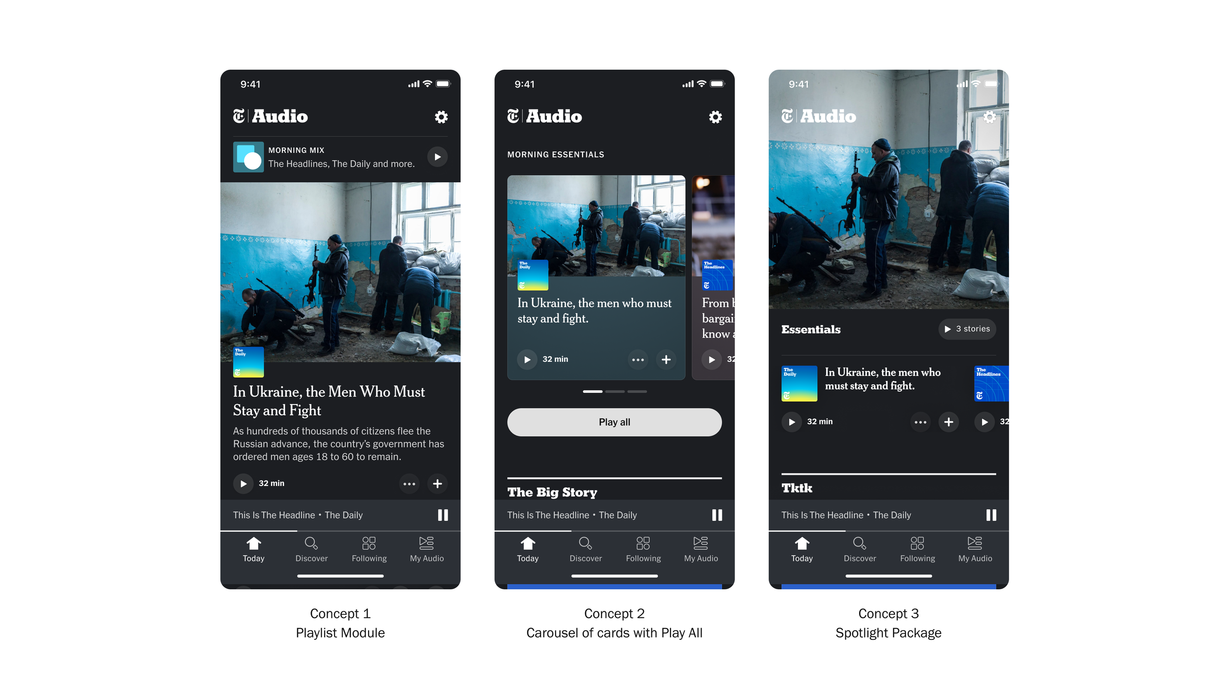
We found that users appreciated the editorial curation but still needed some guidance to making a listening decision. To address this, I set up a two week sprint to work closely with our engineering and editorial leads to think through how we might lessen the barrier to a play.
I explored a range of concepts for how we might present a package of “essential” listens at the top of the Today feed.
We landed on a direction that allowed us to maintain a big visual moment at the top of the feed, and present a carousel of 4-5 stories that could be played consecutively via a "Play All” button.
Since it’s release, the playlist and specifically the “Play All” button has become the most used feature in our app and the driver of return users. The playlist has also been adopted in other projects related to Audio in the core New York Times app.
Episodic Imagery
During beta, I also continued to iterate on the design language of our app and refined how and when images appeared in app.
I scaled back the use of imagery in some areas to allow for more content density, while keeping more premium spots—like the playlist and our fullscreen player—visually-forward to allow our photojournalism to take center stage in key moments.
Component Library
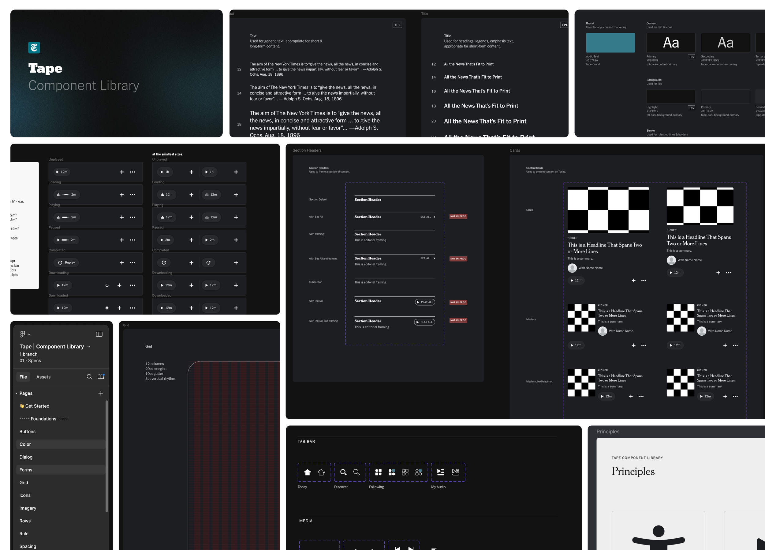
During our Beta, I also began to codify the design language that I had set up. I developed our figma design library, which we named “Tape.”
Working closely with Matt Argomaniz, Design Lead on The New York Times Product Language, I worked to ensure that Tape referenced and utilized the core Times design system while maintaining it’s own distinct feel as a design language for NYT Audio.
Design component library that I developed in collaboration with The New York Times product language team.
Accessibility
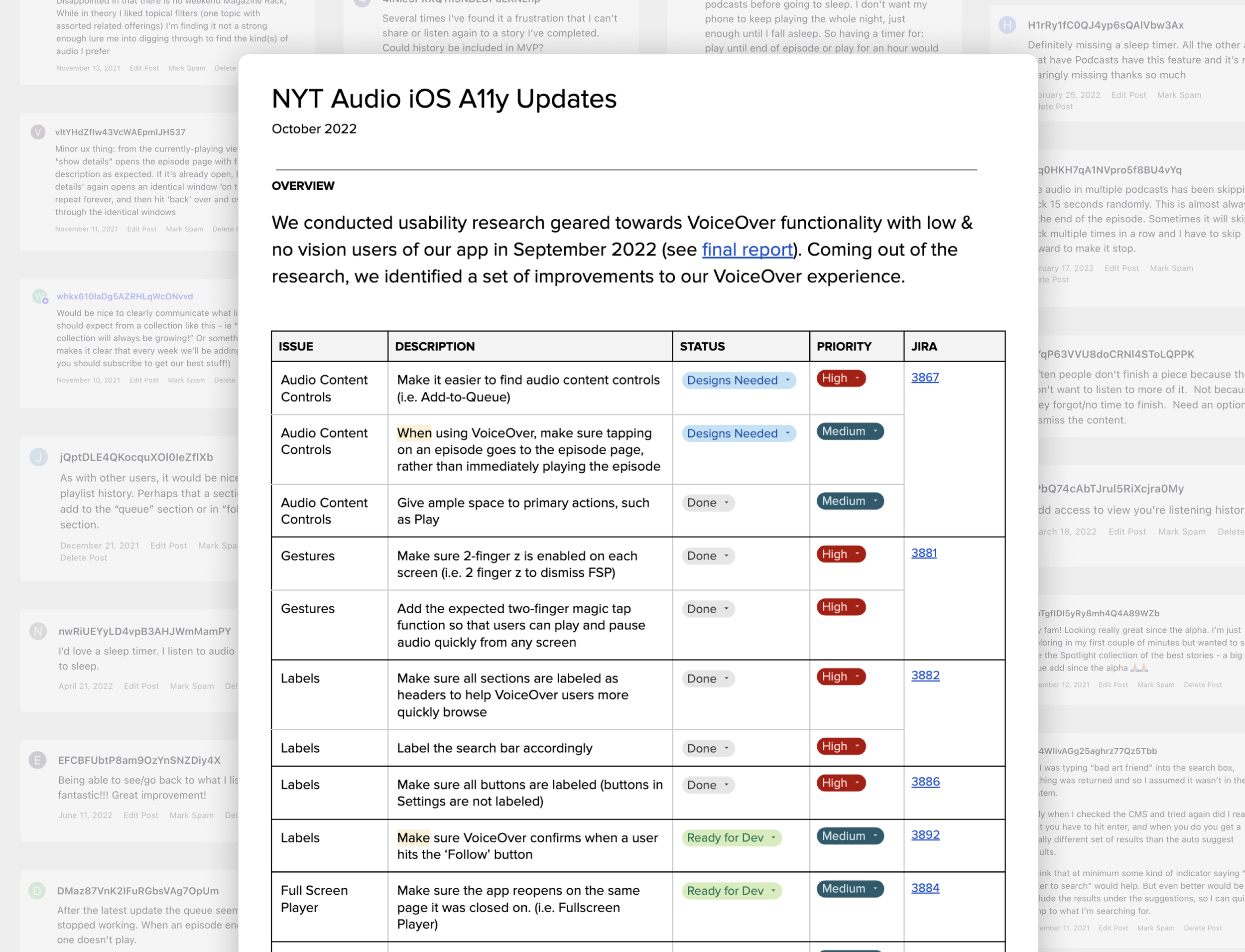
Prior to launch, I championed an initiative to test our approach to VoiceOver. Working with our lead researcher, we tested the app with six users with a visual disability. We found that our efforts to make the app accessible were appreciated by the participants, and made using the app intuitive overall.
But we did identify several areas of improvement—such as ensuring certain content controls were accessible and enabling primary accessibility gestures like 2-finger Z-swipe. I documented and prioritized these issues and worked with product to ensure we would address the high-priority items for launch.
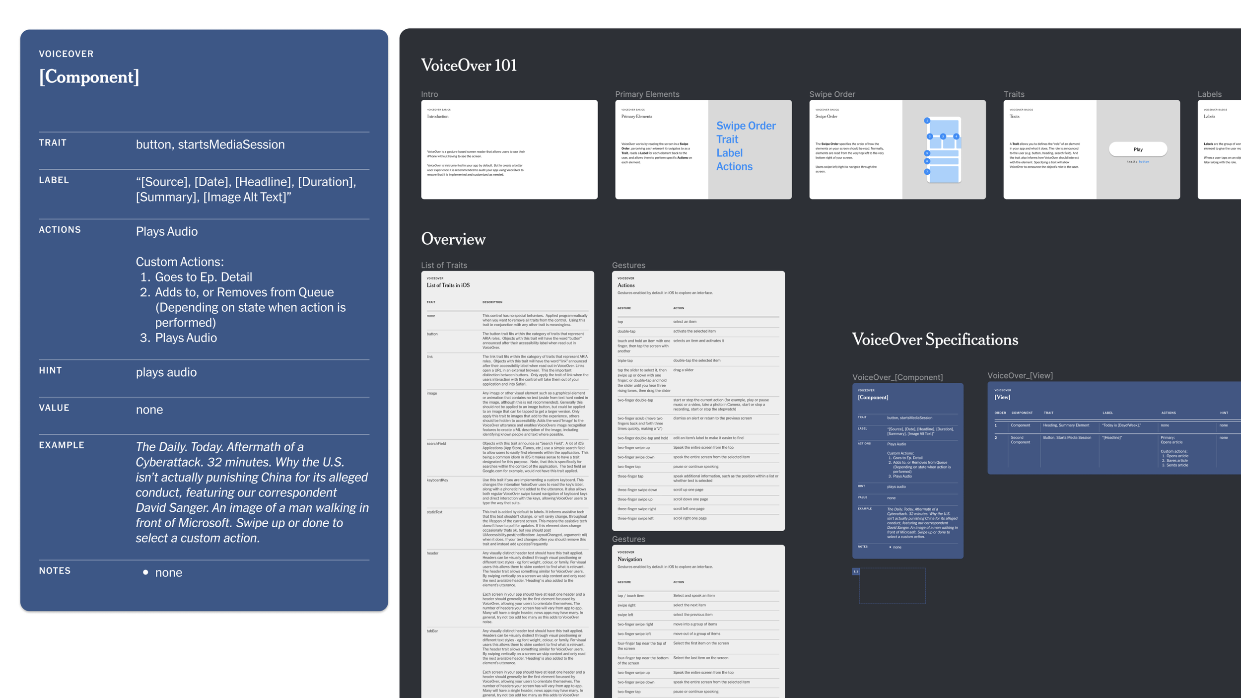
I also created a VoiceOver documentation guide to help our designers on Audio, as well as designers at the Times, create VoiceOver compatible experiences. The documentation has been adopted by the Product Design org and has been utilized on teams across the company.
Accessibility and VoiceOver documentation guidance that I created. Has been adopted by the product design org at The Times for other teams to leverage.
Summary
My work and collaboration with my inspiring team of designers has helped ensure the success of The New York Times Audio app. Since launch, the app has garnered over a million downloads and a dedicated weekly active user base. The app has also informed a larger play in the audio space across The New York Times ecosystem.
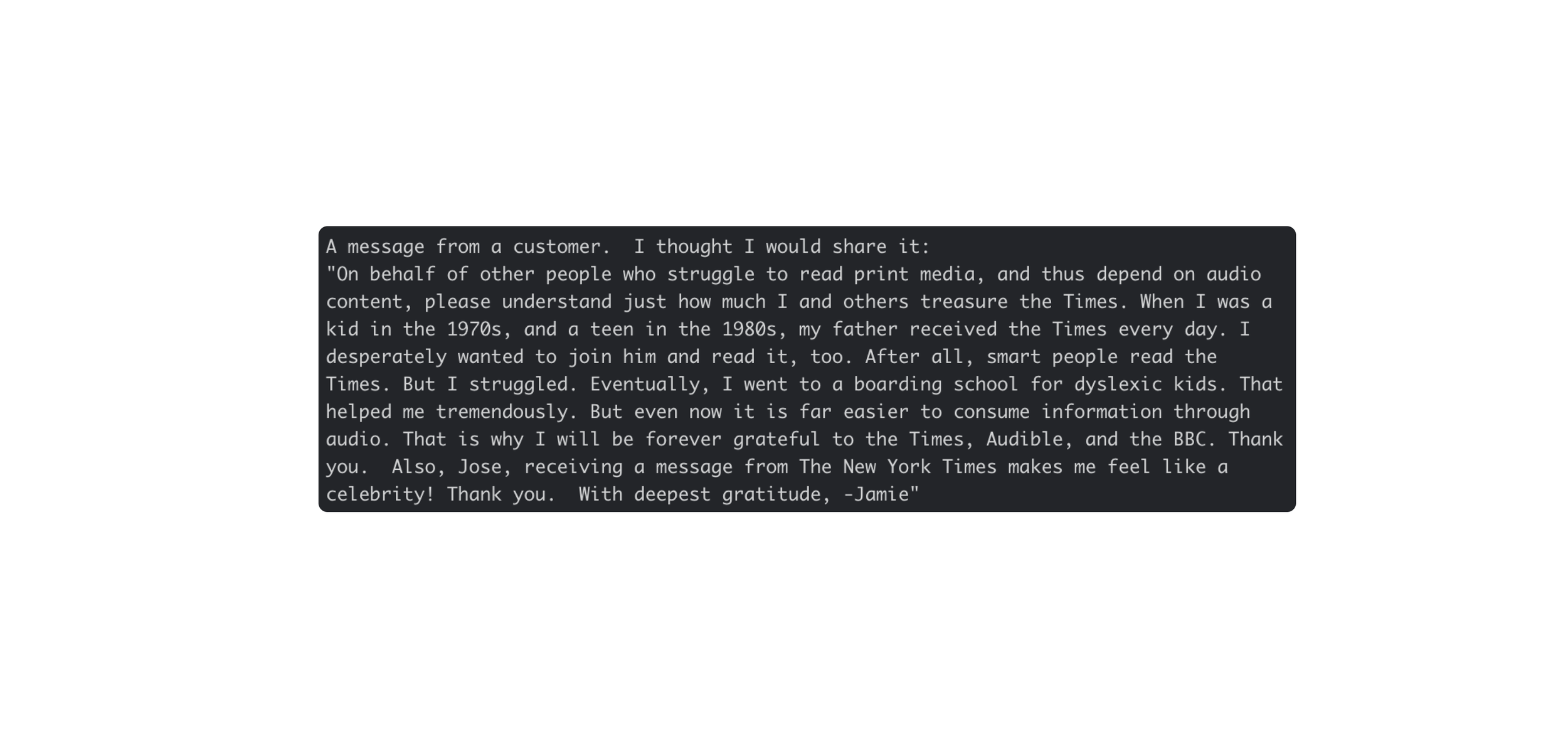
One of the most gratifying parts of the experience by far has been seeing the response from individuals from the Disabled community, expressing their appreciation for making high quality journalism accessible.
