Design Notes
Six Snapshots: Polishing and Codifying our Design Decisions
During our Beta and in the first year of our app being live, I initiated several projects to experiment with how we might increase listenership and improve the accessibility of our app, while polishing and codifying our design language. Here are six.
Lead IC on the Editors' Playlist, codified the NYT Audio design system, and established accessibility practices
Team
Design team of five. Cross-functional team of 15 engineers, product managers, newsroom partners.
Outcomes
- Increased WAUs with the introduction of the Editor's Playlist feature
- Editor's Playlist feature informed audio strategy in Core app
- Helped TPL team tktktk
- Established best practices in a11y documentation
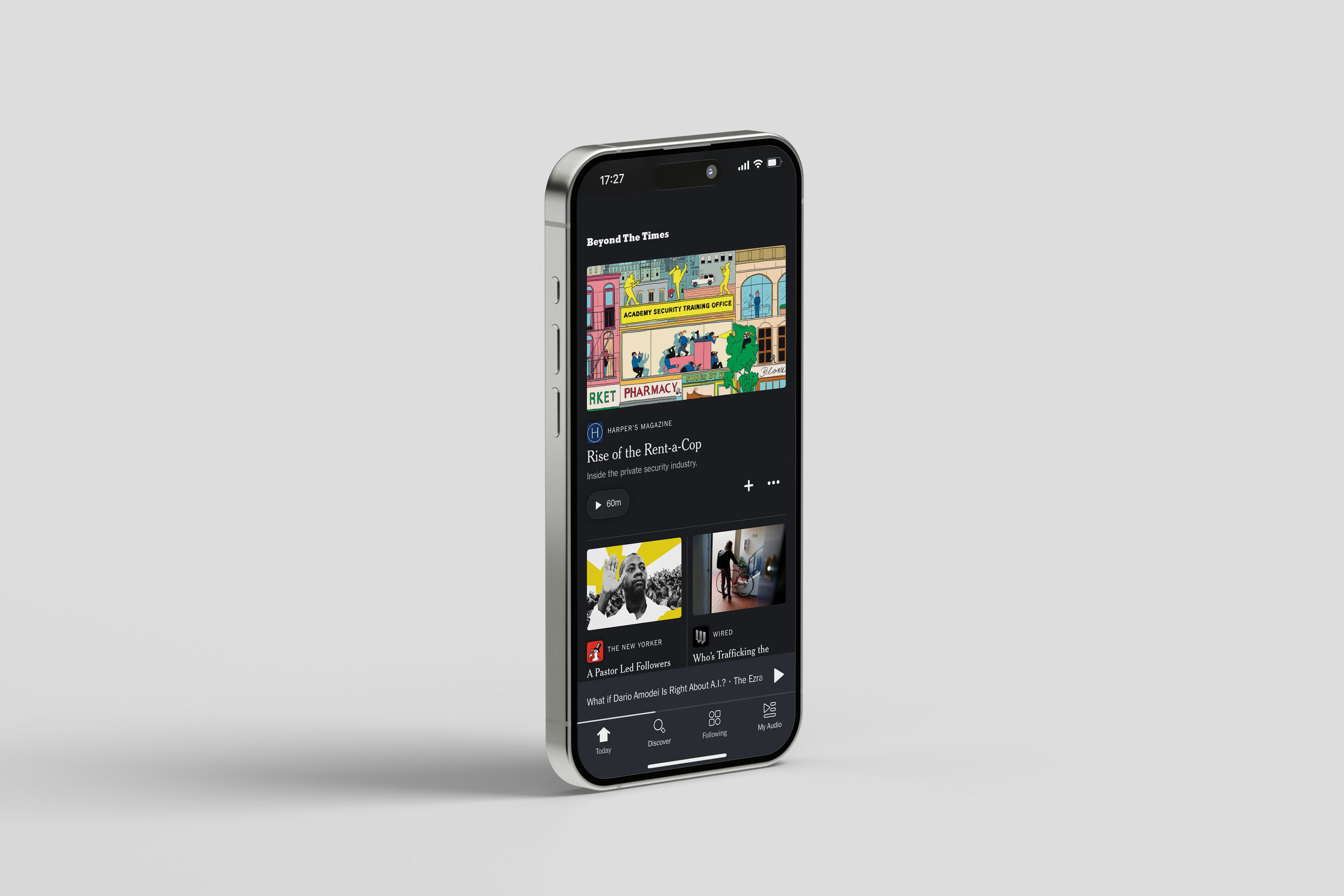
View of the new and improved card toolkit in use, designed by myself and Daman Chatha
Snapshot 1
Editorial Playlist
During our Beta, we saw users expressing appreciation for the editorial curation of the Today feed. But we saw in the data that there was plenty of room to improve time to play. We had an assumption that users still needed some guidance to making a listening decision.
To address this, I set up a two week sprint to work closely with our engineering and editorial leads to think through how we might lessen the barrier to a play.
After initial conversations with my editorial partner, we quickly aligned that what was needed was some sort of playlist at the top of the feed that allowed editors to package a group of “essential” listens for the day. We could position the playlist as a collection that would serve the job of catching you up on the day’s biggest stories.
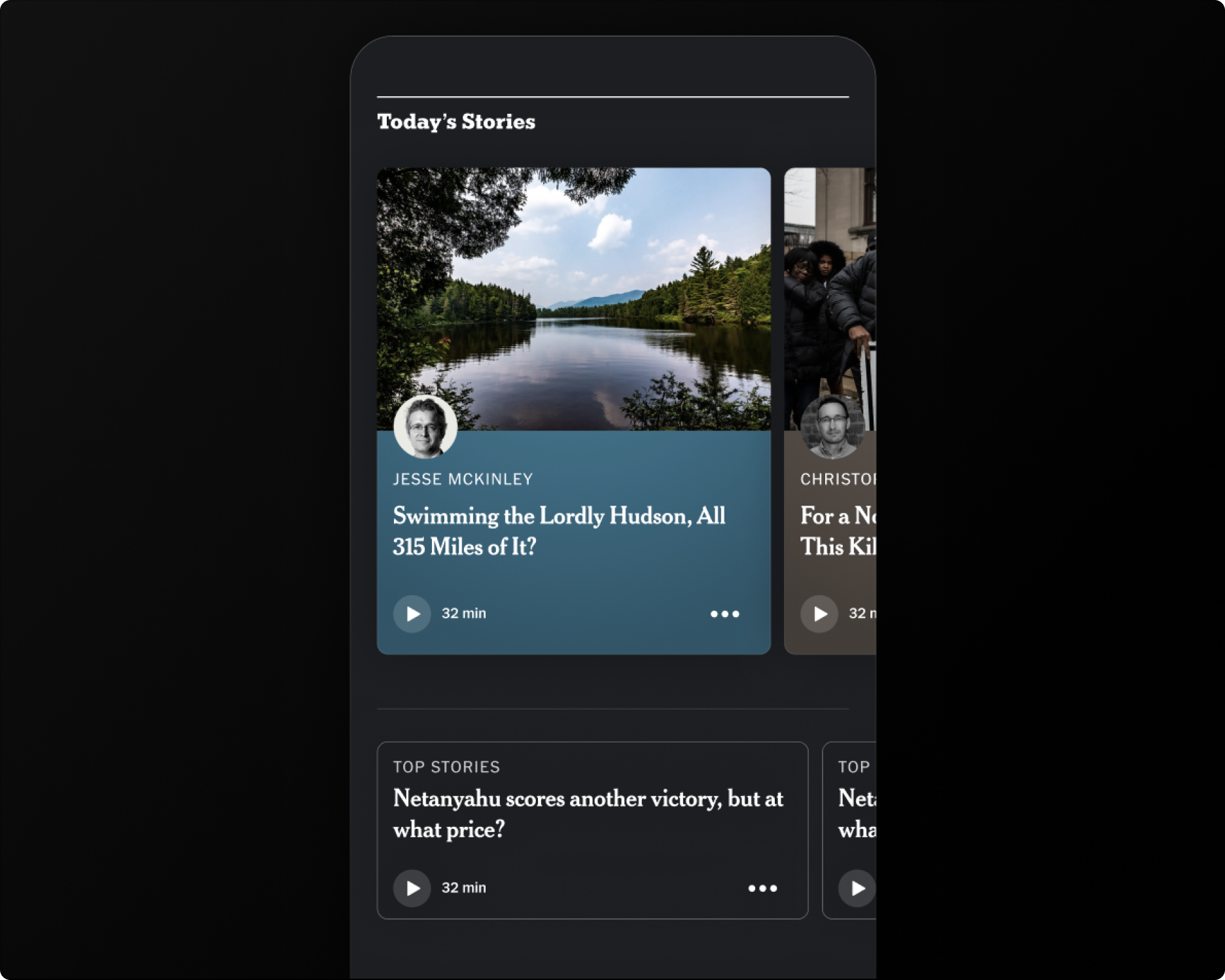
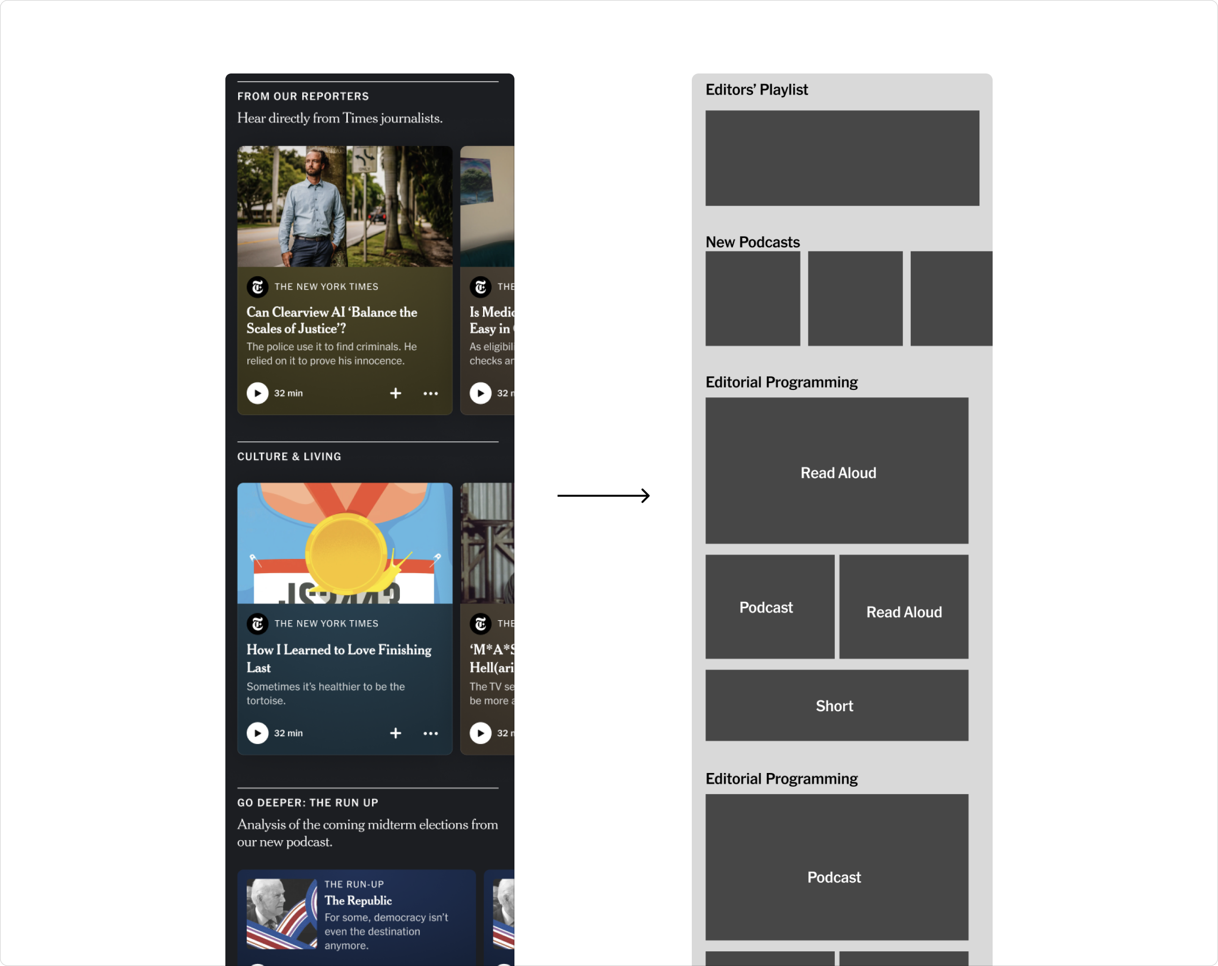
Our today screen at the time presented a single story at the top of feed (left). I explored a range of directions (right) for how we might augment the top of the screen to expose users to more content based off the day’s news—from a module packaging stories in a “Morning Mix” to a carousel of stories with large imagery.
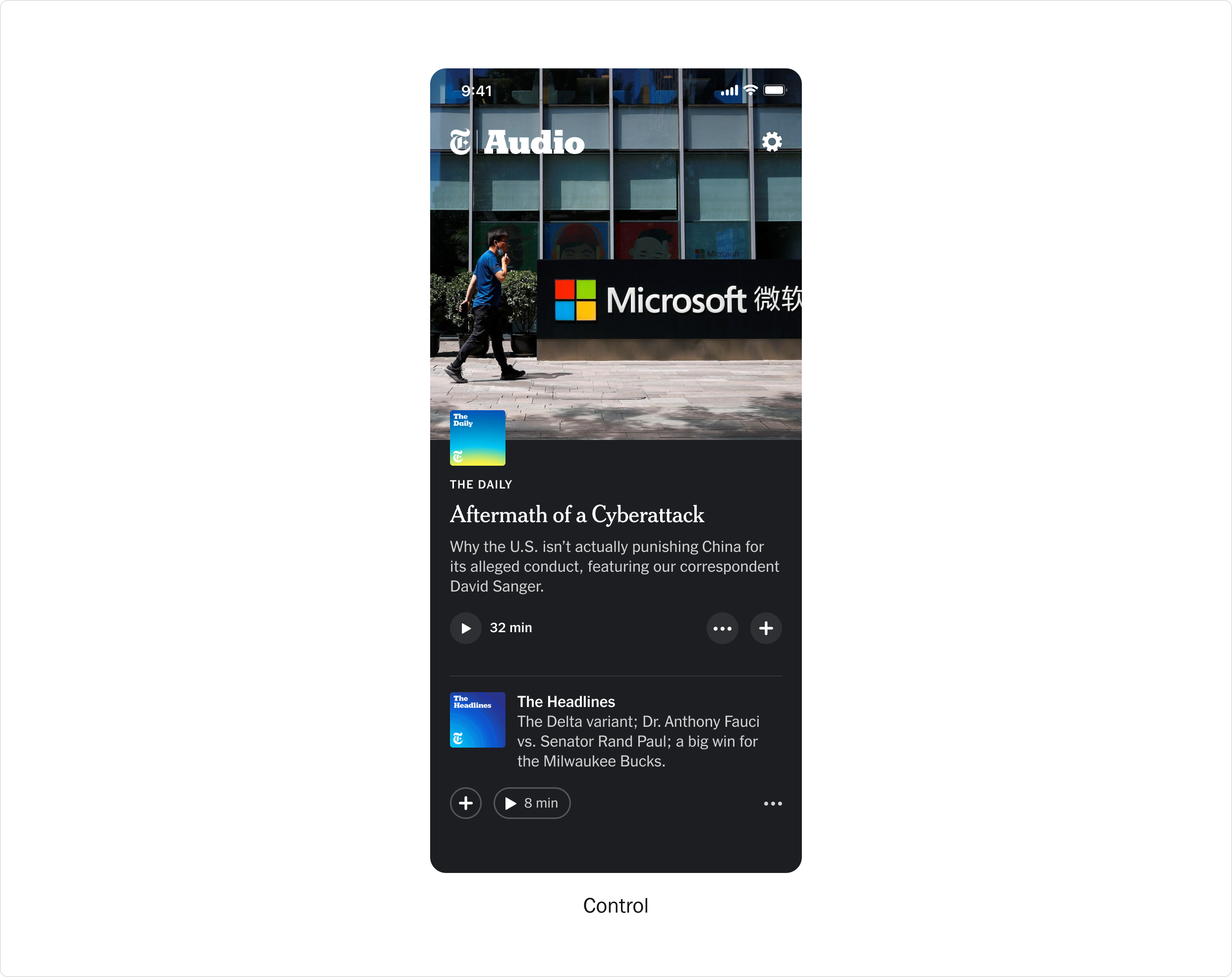
Control with a single story in the Spotlight
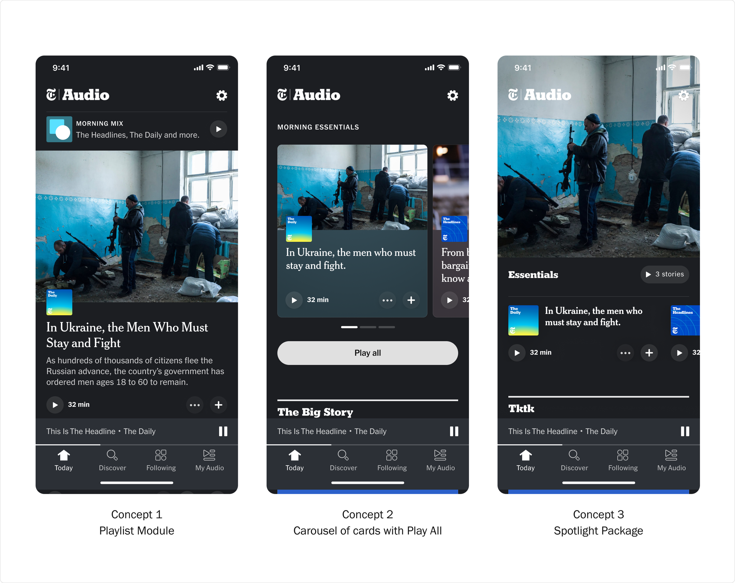
Explorations for a package of essential listens
In reviewing the directions with editorial and product, we collectively felt that it’d be important to maintain a compelling visual moment to set the tone for the feed. We also wanted to expose the stories within the package, and so leaned more towards the directions that utilized carousels.
In our final direction, we kept the prominent play all button from the initial sketches to make it as easy as possible to start listening as soon as you open the app. The play all button would keep users in a continuous listening experience, playing all the stories within the playlist consecutively.
Since it’s release, the “Editors’ Playlist” and specifically the play all button has become the most used feature in our app and the driver of return users. The playlist has also been adopted in other projects related to Audio in the core New York Times app.
Final version of the Editors’ Playlist at launch
Snapshot 2
Exploring the role of GenAI
As the Times began to explore the role of GenAI in our products, we wanted to see how we might begin to introduce synthetically read articles in our app.
The goal was to leverage GenAI to increase the amount of articles we could translate into the audio format. We would primarily use this to help us meet breaking news moments. The app primarily serves up human-produced, human-read content, and so to keep that at the center of our app’s value proposition, I organized a design sprint to figure out how we might appropriately signal our GenAI content and differentiate it from other content in the app.
Working alongside a copy-writer, we came up with various options of where to position GenAI articles, and how to label them. We explored leading with the value proposition of “more content” as well as more explicit signaling (e.g. “Digital Reads”).
We went through lots of conversations with our stakeholders, discussing wether it was important to be more explicit with the signaling and whether users would care. In referencing earlier research, we found that most users did not seem to care whether an article was read by AI, and in fact expected that most articles were read by AI. Also, considering that we were using audio signaling to inform a user that an article was read by AI, we felt comfortable making the recommendation that we should focus more so on signaling the user value, rather than the medium.
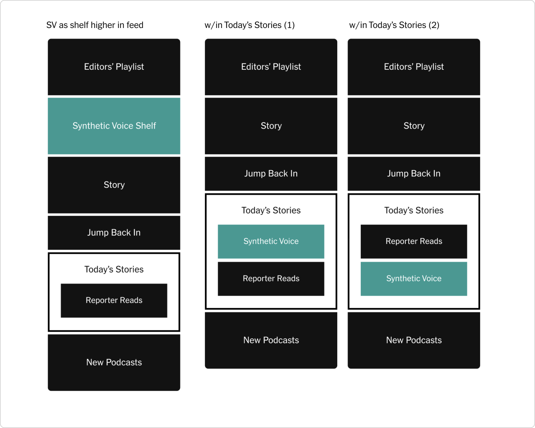
Initial explorations for where GenAI could be positioned in the feed.
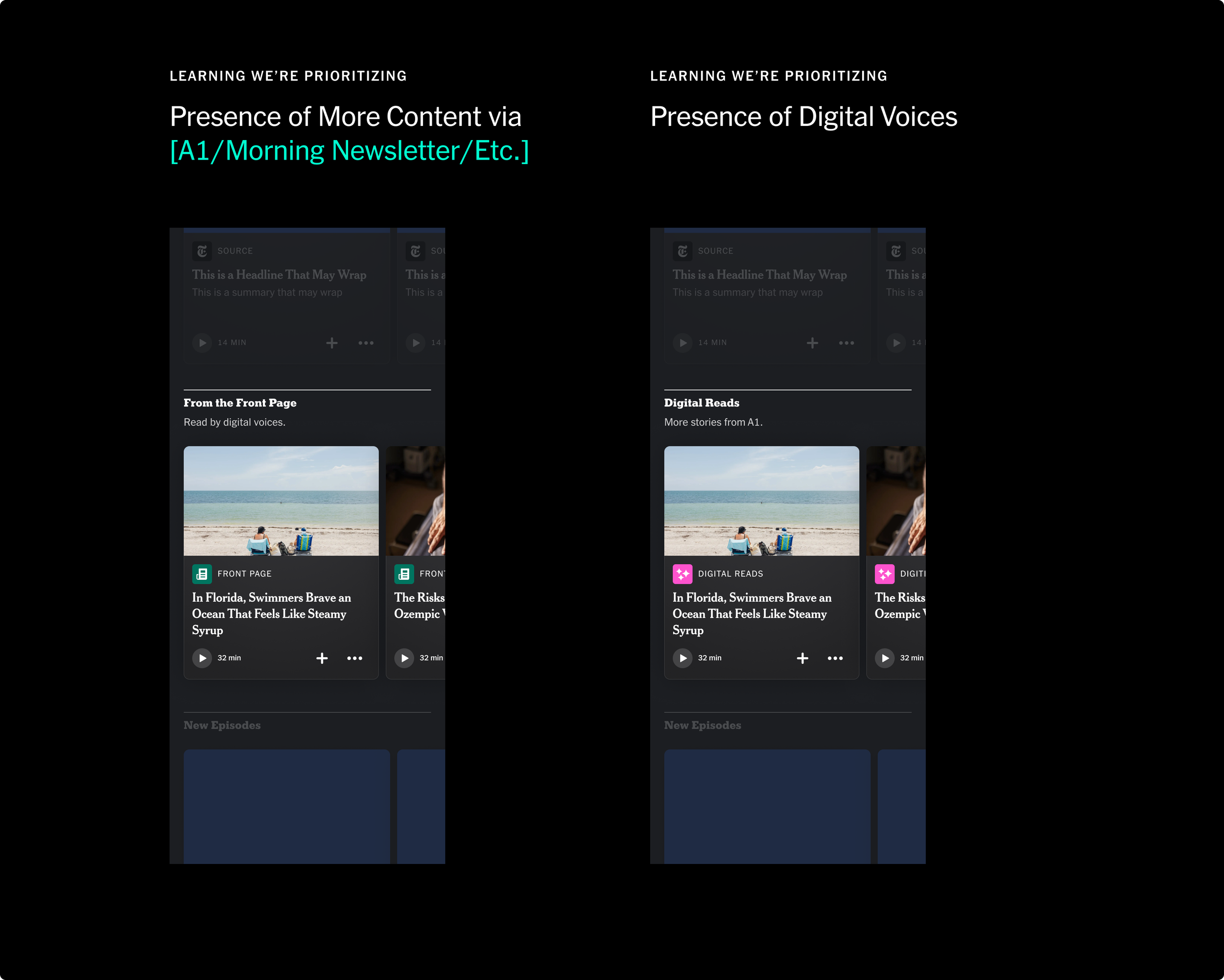
Signaling explorations for GenAI
As part of the exercise, I also pushed us to experiment with differentiating GenAI by further amplifying our human-read content—leaving them more visually prominent, and rendering GenAI in a more utilitarian presentation.
This exploration inspired our stakeholders to invest more work in reporter and human signaling across the product, which we ended up pursuing and building in the app. The work has since informed a broader approach to signaling GenAI audio articles in the core app.
Explorations for highlighting reporter-read content, and treating GenAI as more of a utility.
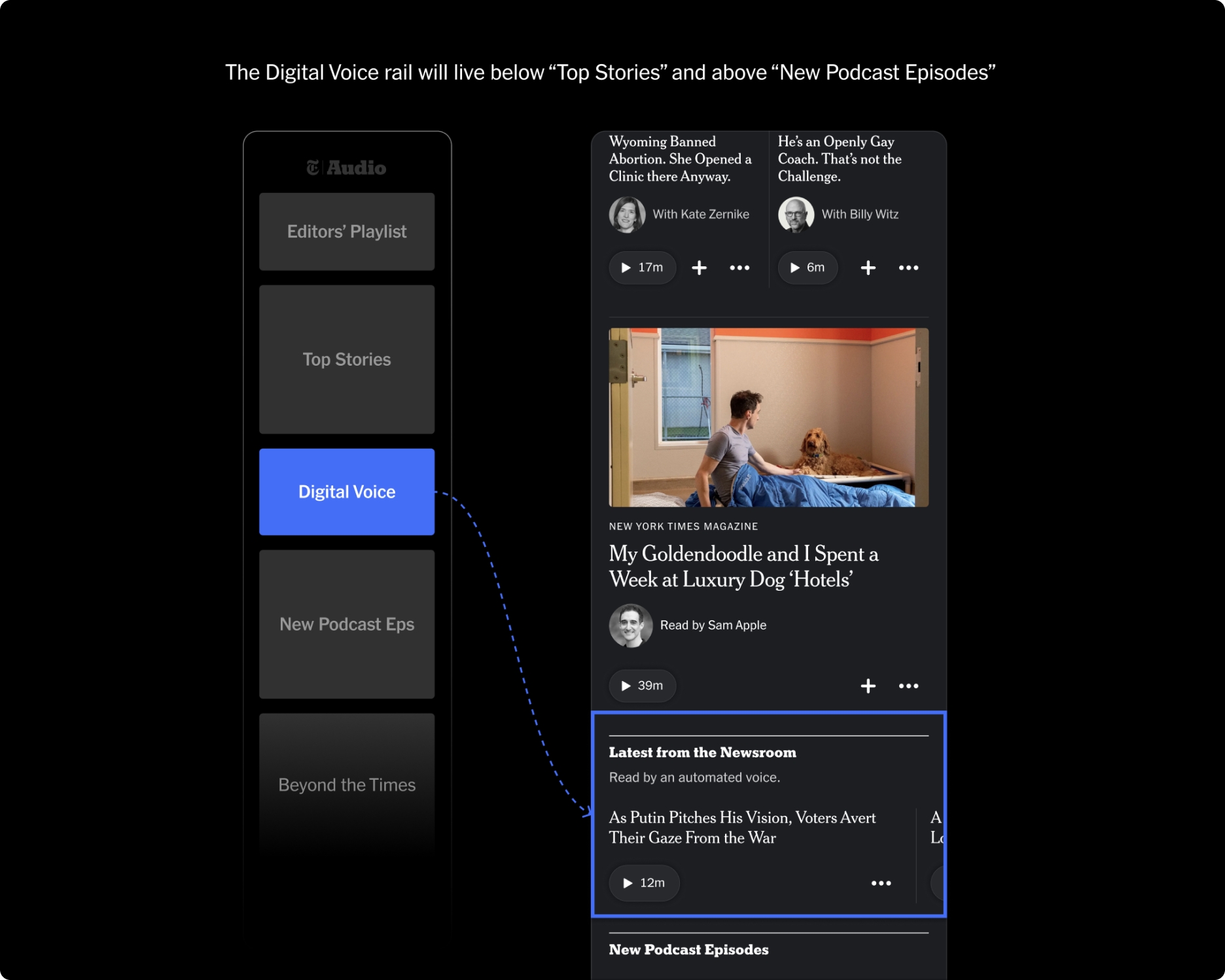
Final approach for GenAI positioning and signaling.
Snapshot 3
Going Vertical
At launch, our app mostly consisted of carousels of content grouped by editorial sections. We were seeing in the data that content in the second or third slots of a carousel higher in the feed were getting less impressions than items lower in the feed. Not great!
To solve for this, and to tackle general improvements that we collectively wanted to make to the Today experience, I organized a four week design sprint alongside one our designers, Daman Chatha, and key members from the newsroom.
Workshop with editorial to test card toolkit updates
Over the course of four weeks, we re-articulated the purpose of today, formed a new set of editorial principles, and established a new card system to allow for vertical programming. Building off of my initial explorations for signaling human voices in the GenAI workstream, we also explored how we might bring in bylines and headshots to bring our reporters front and center.
Daman and I co-faciliated our conversations with our editorial partners. I led the development of the new card toolkit, leveraging the type styles set in place by our Times Product Language team—to ensure we maintained consistency with the core app, and to ease implementation by using tokens that they built.
The work was then picked up by the product team and prioritized for immediate release. Since launching the new card toolkit, we saw an increase in impressions with content positioned lower in the feed.
Initial wireframe exploring vertical layout and density
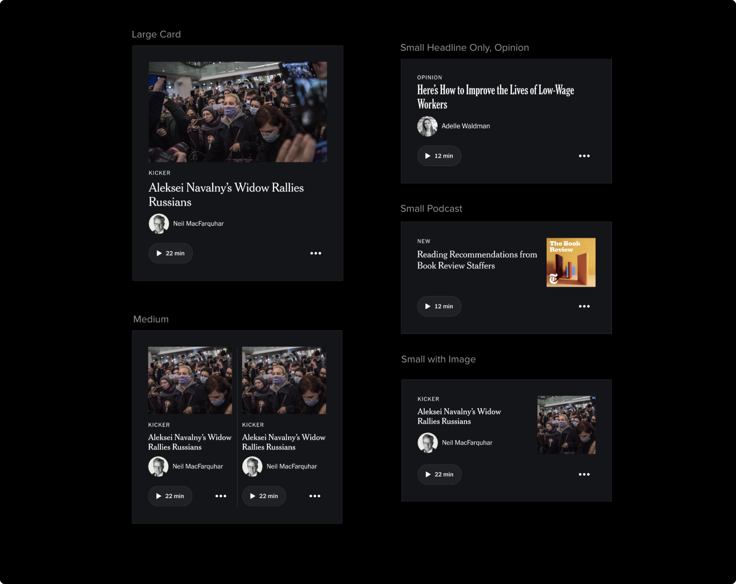
Final proposal for card toolkit improvements to allow for vertical programming
Snapshot 4
Imagery and the Fullscreen Player
In our Beta, I also continued to iterate on the design language of our app and refined how and when images appeared in app.
I scaled back the use of imagery in some areas to allow for more content density, while keeping more premium spots—like the playlist and our fullscreen player—visually-forward to allow our photojournalism to take center stage in key moments.
Within our fullscreen player specifically, I wanted to improve how images were presented. In the Alpha version of the screen (left), images took up the entirety of the screen and the controls displayed on top. This led to some accessibility issues with controls getting lost in lighter images, and also compromised the editorial integrity of the photojournalism.
To address this, I refined our fullscreen player to separate images from the controls (right).
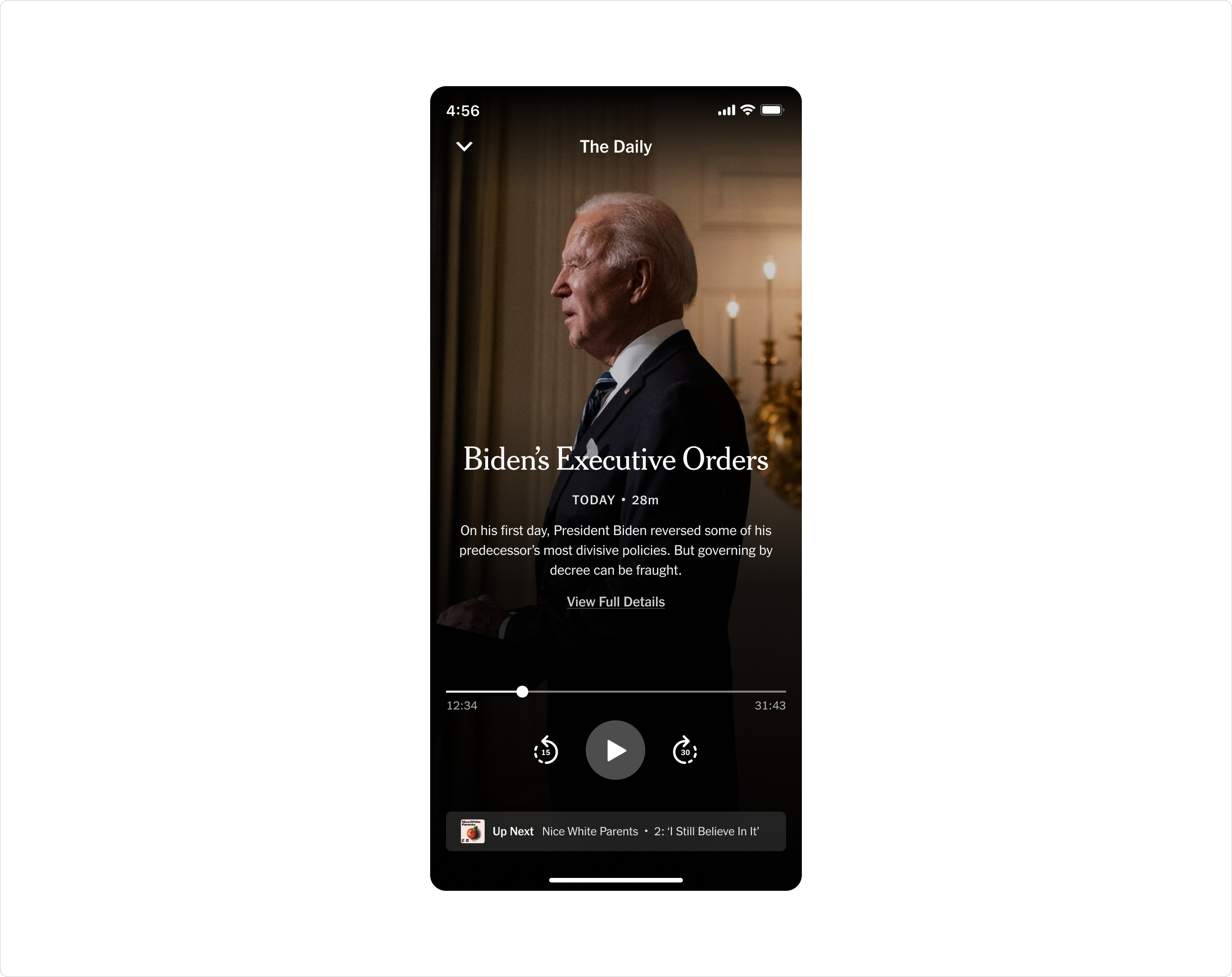
Alpha version of fullscreen player
Improved fullscreen player for accessibility and image legibility
Our photo editors and brand team were very appreciative of the change in this approach—as it allowed them to ensure that images maintained their visual integrity throughout the app.
Within this direction, I also explored how we might use the space that the image occupies to introduce other features in the future, such as transcripts and content chaptering. This work has inspired various attempts during hack weeks to build out a transcripts feature, which we are looking to bring onto our official roadmap soon.
Explorations for transcripts and content chaptering
Snapshot 5
Component Library
As our decisions began to solidify closer to launch, I started to codify the design language into a Figma library, which we named “Tape.”
Working closely with Matt Argomaniz, Design Lead on The New York Times Product Language, I worked to ensure that Tape referenced and utilized the core Times design system while maintaining it’s own distinct feel as a design language bespoke to NYT Audio.
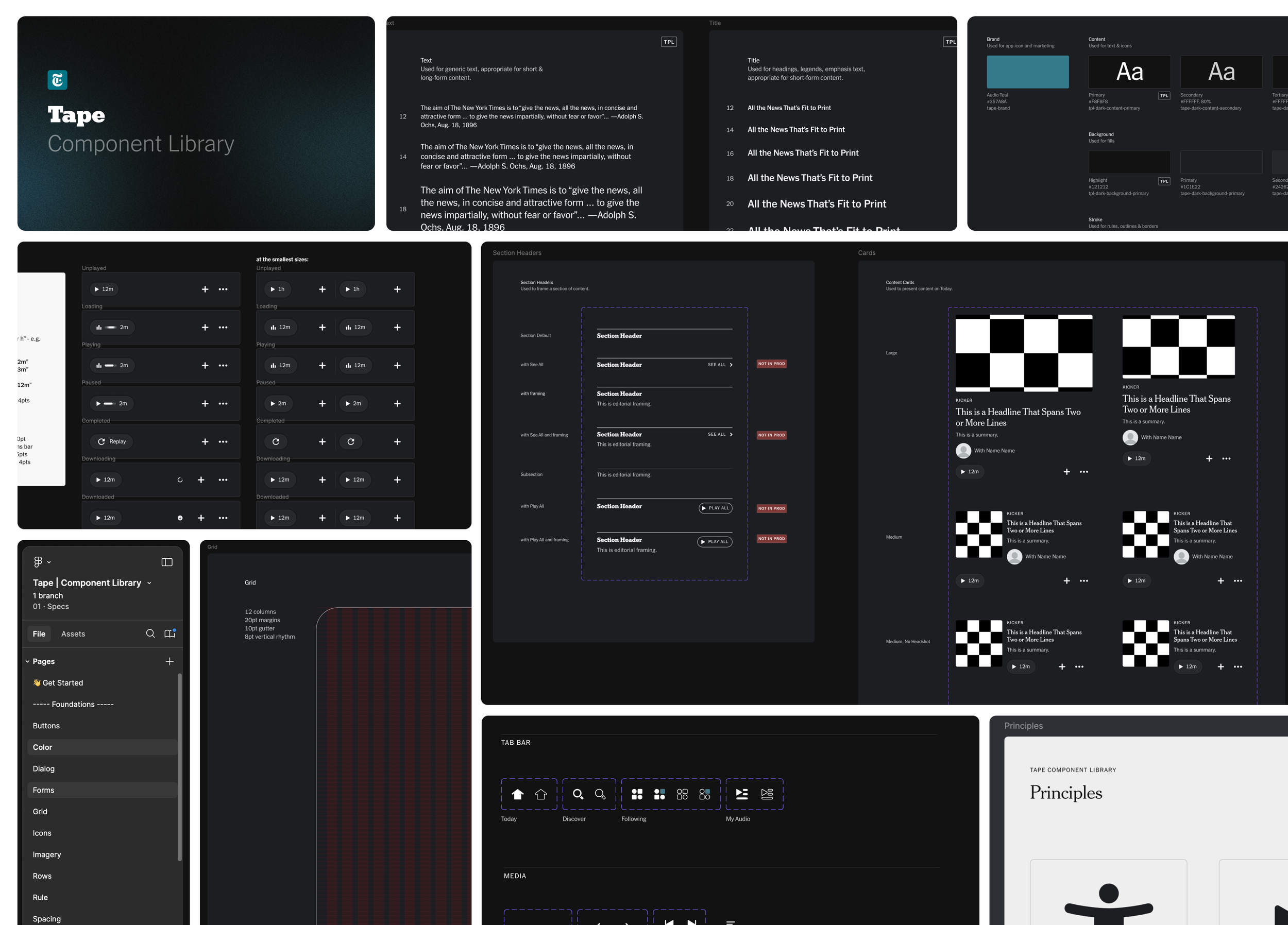
Design component library that I developed in collaboration with The New York Times product language team.
Snapshot 6
Accessibility
Throughout the design phase, I also worked closely with one of our iOS engineers, Alvin Andino, to establish our approach to VoiceOver. Given that audio by nature is a medium that makes the Times’ journalism more accessible for individuals with visual disabilities, I wanted to ensure that we considered how those users might navigate the experience. One area specifically was exploring how we might make navigating the Today screen feel more seamless.
Fortunately, a lot of Swift components come with VoiceOver compatibility. But in testing our first builds with VO, I found that the out-of-the-box method for how components were labeled made navigating through stories feel more cumbersome. Each element was read aloud individually.
So for instance, a user in VoiceOver would navigate to a story and hear the name of the podcast. They would then have to gesture to hear the headline. Then gesture to hear the summary, and so on. To solve for this, I decided that we could try grouping labels and rely on custom VO actions to allow users to navigate quicker. See the demo below showing before and after we implemented label grouping.
Video demo of label grouping
With improvements like the above in place, I wanted to validate our assumptions with some user testing. And so prior to launch, I championed an initiative to test our approach to VoiceOver. Working with our lead researcher, we tested the app with six users with visual disabilities. We found that our efforts to make the app accessible were appreciated by the participants, and made using the app intuitive overall.
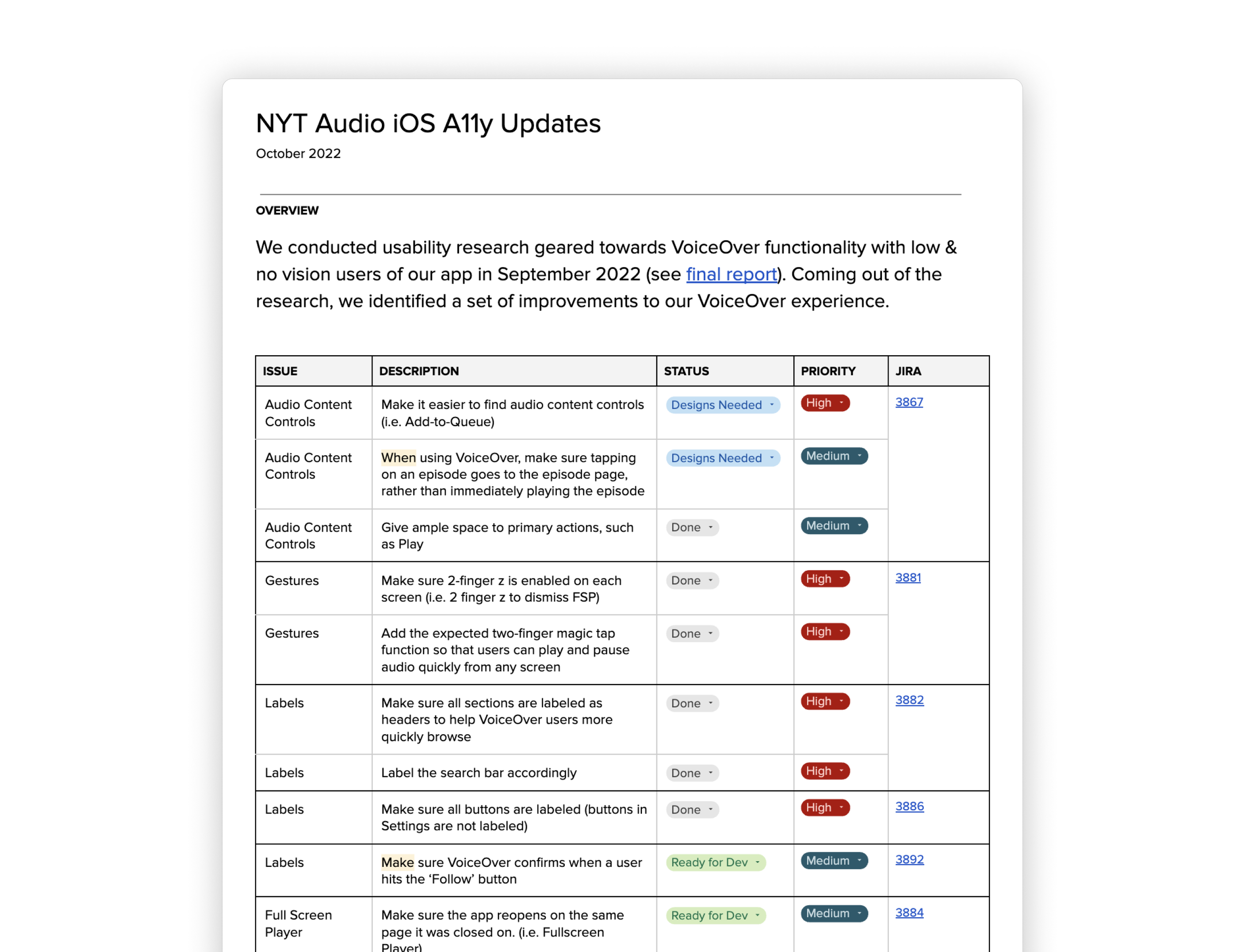
But we did identify several areas of improvement—such as ensuring certain content controls were accessible and enabling primary accessibility gestures like 2-finger Z-swipe. I documented and prioritized these issues and worked with product to ensure we would address the high-priority items for launch.
In my work with VoiceOver, I also developed a Figma component that would allow us to more easily create VO annotations for our designs. The component was informed by Apple’s HIG on what elements needed to be specified to create VO experiences. The annotation guide has helped our designers on Audio create VoiceOver compatible experiences. Since developing the guide, it has also been adopted by the Product Design org and has been utilized on teams across the company.
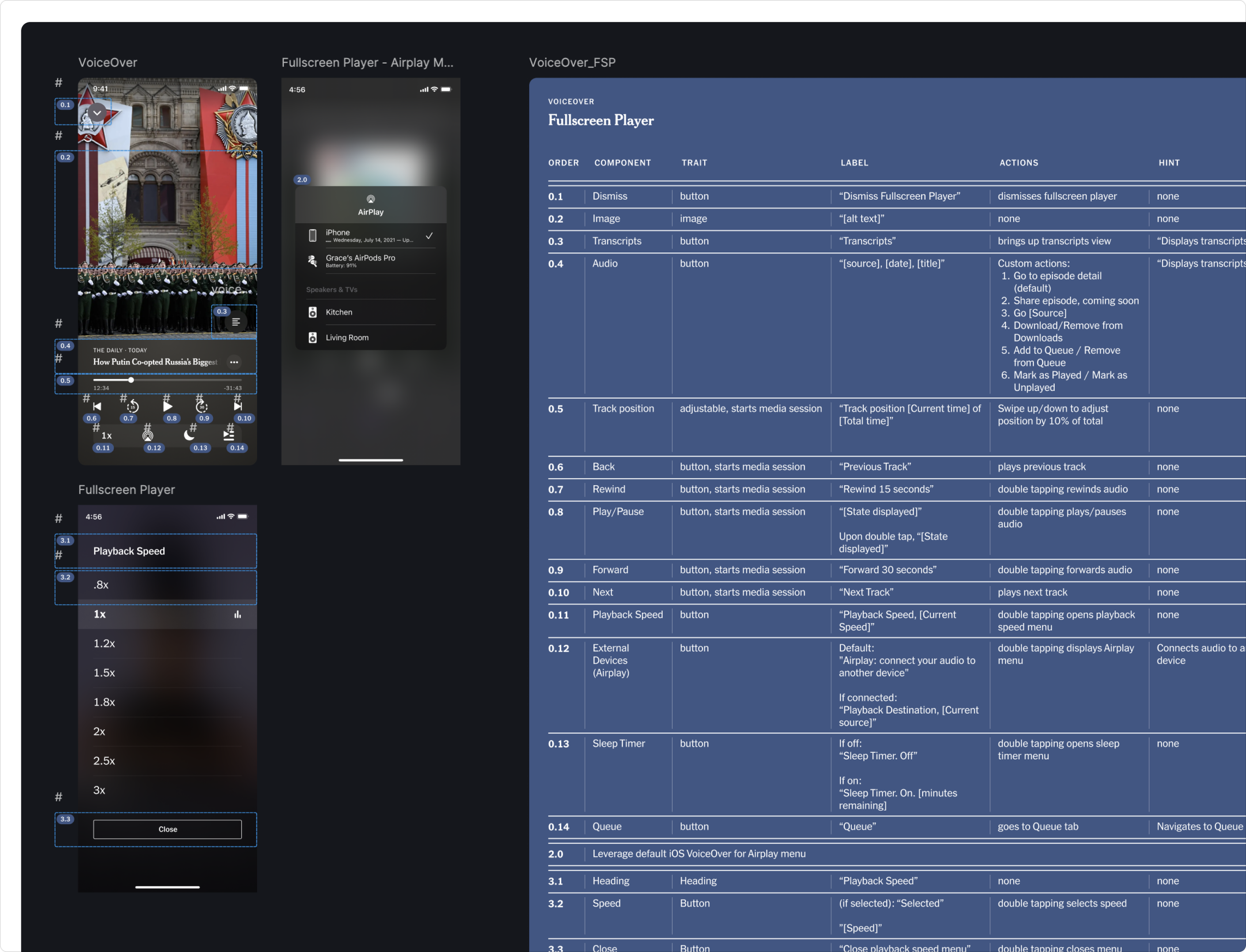
Voiceover documentation in use.
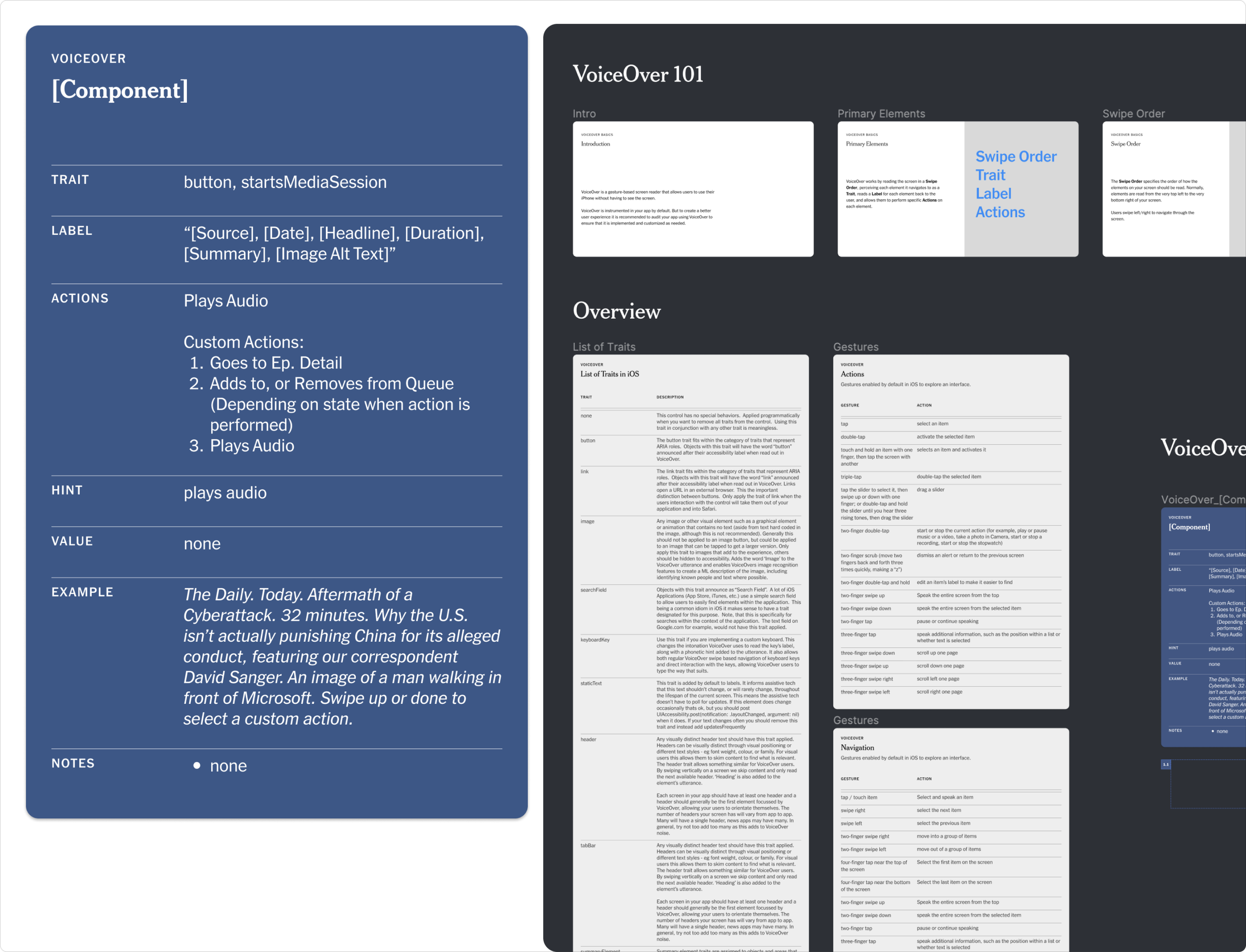
Accessibility and VoiceOver documentation guidance that I created. Has been adopted by the product design org at The Times for other teams to leverage.
Summary
One aspect I particularly enjoy about design is the opportunity to help bring clarity to people—whether that be the users of a product or the individuals around you that build it.
Since launching the various design improvements and documentation mentioned in this case study, I’ve been able to help increase our numbers of weekly active users and conversion to play, build better partnerships with our cross-functional partners including brand and newsroom, as well as help improve how the Times designs with inclusivity in mind.
Next: Reimagining NYT Audio →