Design Notes
Designing NYT Audio, From Sketch to Launch
Close to the start of 2020, I joined a small team to figure out how we might productize the New York Times’ audio report. Over the course of three years, I helped ideate, design, build and ship what would become NYT Audio—from scratch.
Here’s a quick look at how I took the app from our initial sketches through our testing phases and into market.
Lead IC overseeing design for key surfaces from exploration to launch.
Team
Design team of three at start to five at launch. Cross-functional team of 15 engineers, product managers, newsroom partners.
Outcomes
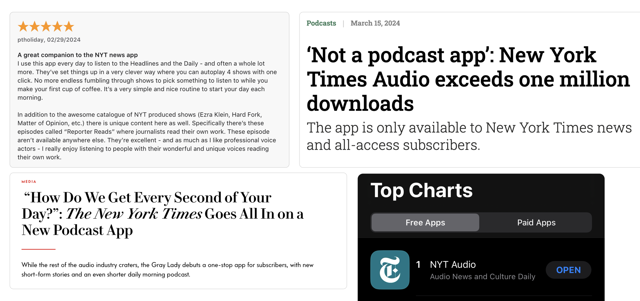
- Debut at #1 in app store, 4.7 rating
- 145k weekly active users
- Attracting a younger and more diverse audience
- Established best practices in a11y documentation
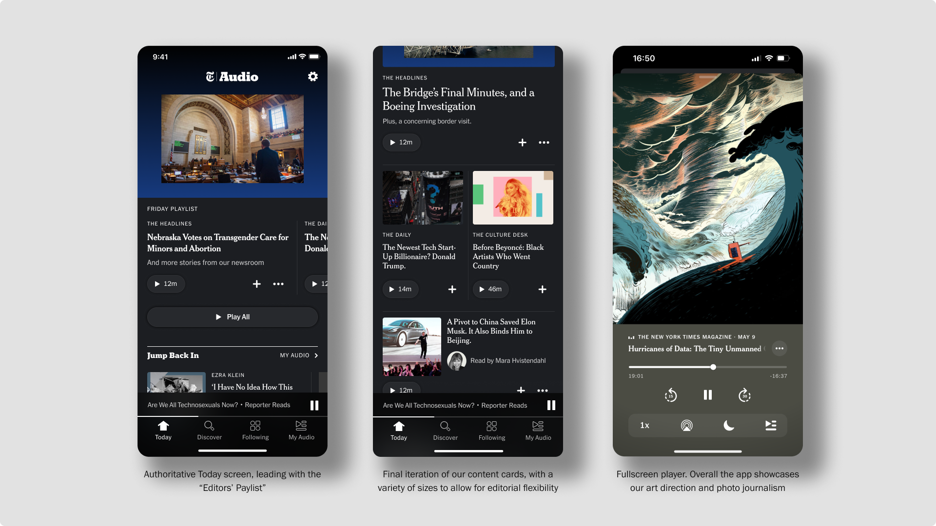
A view of the Today screen at launch that I designed.
First off… why an app?
This is the question I first asked Alex Rainert, our head of Audio product, when I interviewed for the role.
He validated some of my assumptions in his answer. It can be hard to build things. Especially at a company that is highly dependent on the news cycle and thus has a lot of short-term goals to meet. So to even attempt to validate and build some version of audio in our news app, we’d have to slot into existing projects, roadmaps, and goals.
Additionally, we had a belief that the decision to consume audio happens well before you open an app. So to truly meet the needs of a listener, we’d have to create an experience that is audio-first… not reading-first.
The problem to solve
When I joined the Audio team, there was plenty of research that had been collected on audio habits amongst Times subscribers. The one problem that we felt that we were in the best position to solve was helping people discover something great to listen to.
We wanted to capitalize on the Times’ reputation as a voice of authority. Our assumption was that we could position ourselves as a daily recommender of high quality audio journalism.
Additionally, I had some initial thoughts around how we could specifically solve for discovery in a design approach:
Mirror the hierarchy of the NYT front page to give our home experience a sense of narrative
Differentiate from podcatchers by putting editorial at the forefront to explain why a story is worth listening to
Leverage photojournalism as a signal to compel users to a story, and to help distinguish our product from other audio apps that are filled with squares of album and podcast covers
Principles
To help us make decisions in our early design and product work, I established some principles for our small team to refer to. These principles informed our explorations and help us align on what we wanted to remain true in our work.
First Draft
With Kevin and Grace, we organized our design process to have us each diverge and explore various ways of solving for our core user need: helping listeners discover something great to listen to.
We each explored different approaches to IA and content structure. One idea I explored was around creating two feeds—one to meet the news moment of the day, and a second to highlight and showcase evergreen features:
Early wireframes for a two feed concept
We were working towards a pretty aggressive deadline to share an illustrative picture of what we might build with our executive team in order to get further support on the project. And so in my work, I pushed the team to jump back and forth pretty quickly from sketches to provocative design mockups.
As part of my design practice, I love to build prototypes. From my consulting days at Meta, I picked up Origami— and have gotten comfortable at building motion prototypes fairly quickly. Below is a prototype exploring more of a visual-forward UI to lean into a sense of immersion and getting lost in our audio stories.
These prototypes and early explorations helped us move quickly to gain alignment with our stakeholders. Seeing something that felt more real helped them more tangibly imagine what the audio app could be.
Between each of the early concepts we explored—which we vetted in early rounds of user research—we started to coalesce around a simple, three tab structure as a north start that contained—an editorially curated Home, a Discover acting as a search and catalogue, and My List which would house expected user preferences. This set the foundation for what we could build quickly and start learning from.
A motion prototype testing an immersive, visual-forward home screen.
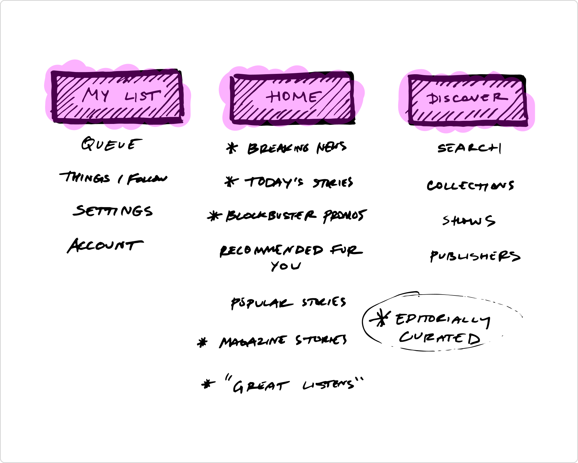
The app map we landed on at the end of our sprints, illustrating a simple three tab structure.
Second Draft (Dogfooding)
We were ready to start learning! Abstracting our early explorations and the app map into its simplest form, I designed a single feed that we could build quickly to test internally amongst ourselves and our stakeholders.
This initial six week release would be leveraged to allow our editorial team to begin iterating on their programming workflow and to test our core value proposition.
The feed contained—
A programmable stream of content that allowed editors to present a set of stories each day.
A spotlight section intended to frame the day with a single story you should listen to. This usually belonged to The Daily on weekdays, and This American Life on the weekends.
A series of large cards highlighting each story.
Screenshot of specs I created for our internal test.
We saw positive responses from our internal release. We found that we had enough audio content to readily program daily, and we collectively found promise in the core value proposition of a newsroom-powered audio app.
Third Draft (Alpha)
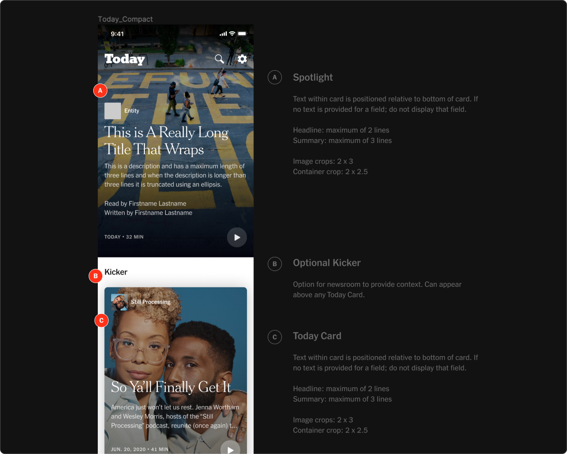
We worked towards a larger release to a group of ~250 internal employees. I worked to refine the experience, exploring our tab structure, and iterating on our “Today” experience.
As our app ingested not only Times content, but narrated articles from external publishers, one problem I set out to solve was how we might guide users through all the types of content on offer.
Here’s a view of our app at Alpha. In it, I led exploration around:
Framing the day by leading with a big moment at the top of the feed to make it easy for users to jump into an important story
Editorially-labeled sections and descriptive framing to guide users to making a listening decision
Square artwork for podcasts versus circle artwork to denote publishers
A “read-aloud” article tag for additional differentiation
Using specific type styles to further differentiate Times content from third-party publishers
Our Today screen at Alpha, showing various decisions around editorial framing, hierarchy, and content signaling.
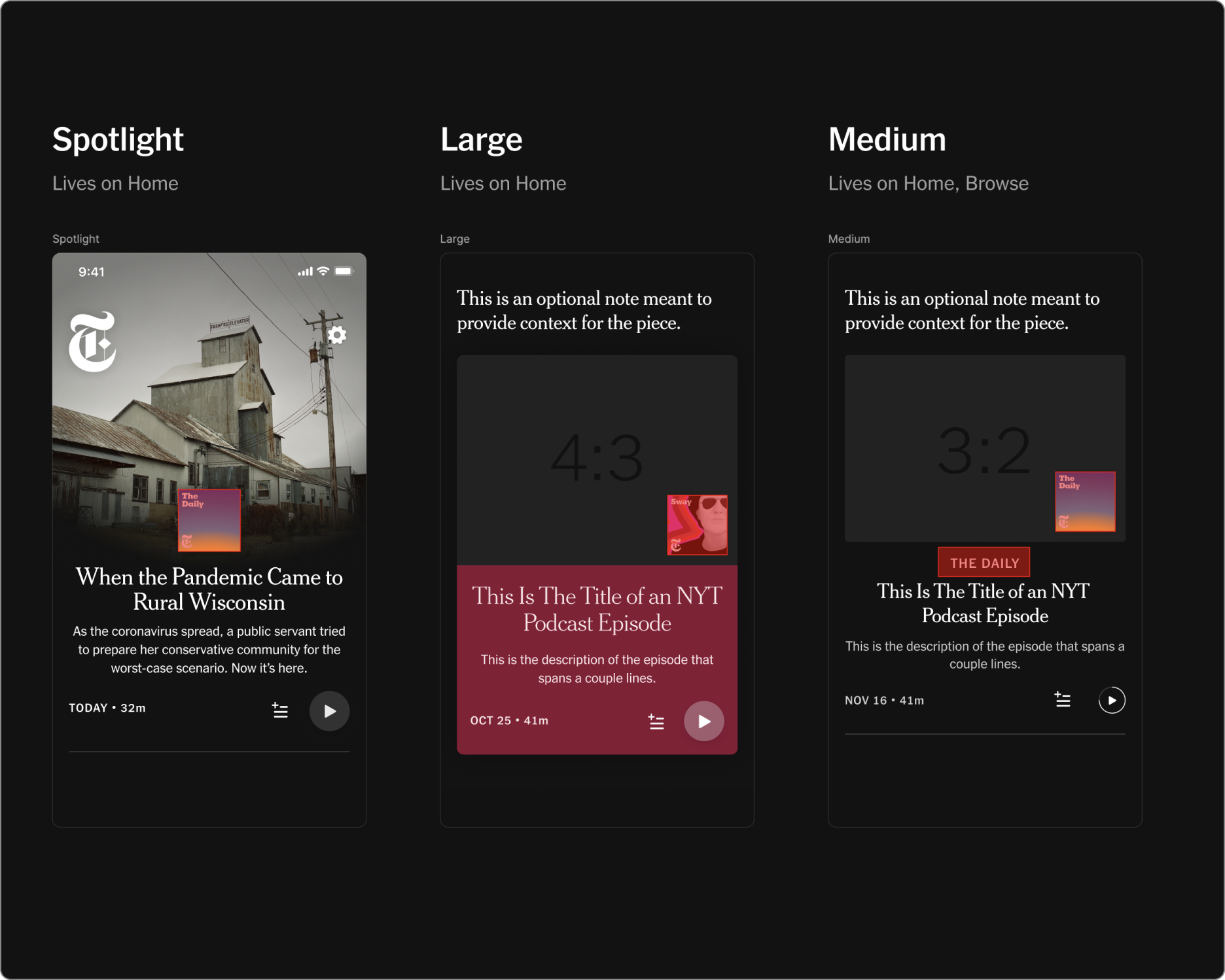
Screenshot of specs for various card sizes I specified for our Today screen.
Final Draft (Public Beta… to launch)
There was a lot of internal usage and praise during our Alpha. Satisfaction and indispensability—our primary metric—was high and we got the institutional support to pursue a public release.
And so, we mobilized to launch our Beta to an external audience of ~200k, where we would continue iterating on the app and get real-time feedback.
During our Beta phase, we learned what features we should prioritize building next—essentials like a sleep timer—as well as identified opportunities to increase time to play. We received feedback through a Beta button that I designed and placed at the top of our home screen. Via this button, we got direct comments ported into Slack from real users of our app. This feedback directly informed our roadmap, and helped us prepare the app for launch.
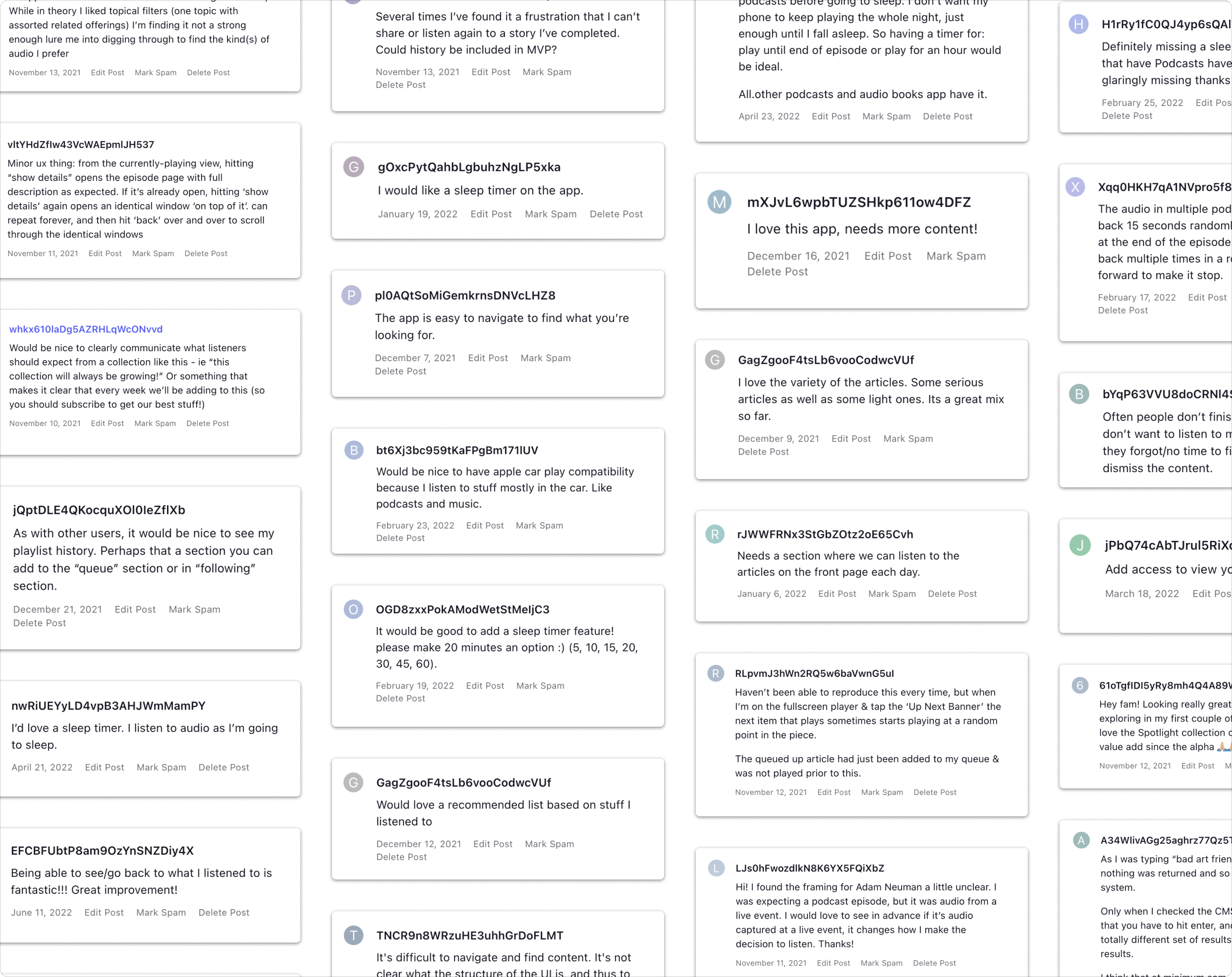
Screenshots of direct feedback from users.
We also began to grow the team at this time. We brought on three new hires that I helped mentor. Working with our growing design team, I consulted and helped guide numerous projects—from improvements to our overall content card system to informing work on the introduction of the My Audio tab. I also designed and led a number of key features, which I touch on in Design Notes #2.
Summary
With the help of our amazing marketing team, the app launched successfully, reaching #1 in the news category in the app store on launch day. Since its release, we’ve reached over a million downloads, and have gotten a steady weekly audience of 147k users—which we’re looking to improve upon.